
I helped a local construction company redesign its website.
I was lucky to work with Garrett Camp on his website for Camp Builders. When we first started working together, he expressed a desire for a cleaner, more modern site that reflected his company's essence. He wanted to establish his brand with terms like: good design, attention to detail, great communication, and reliability. Here is what we made.
AFTER
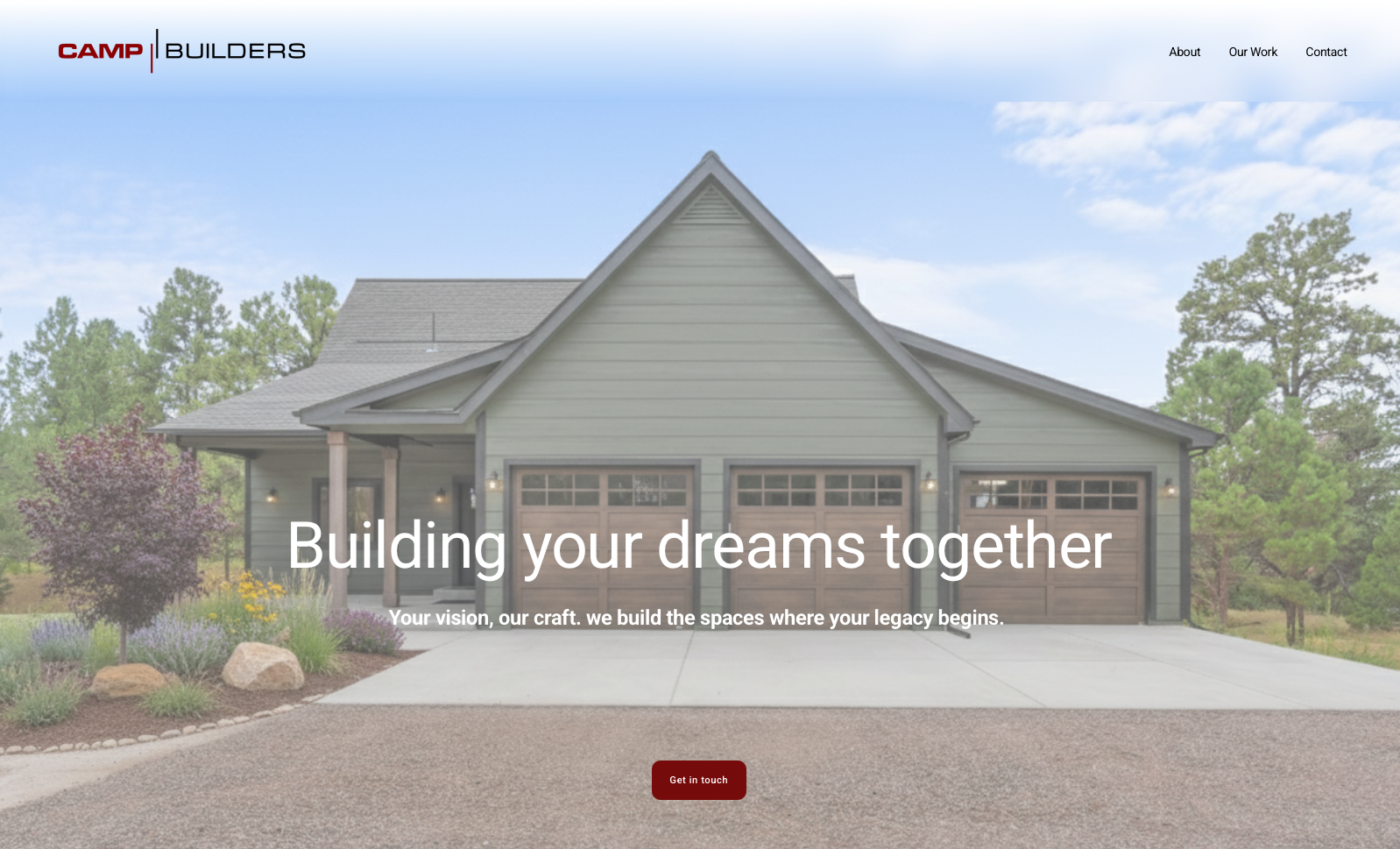
New hero image and intro copy
Here is what it looked like before.
BEFORE
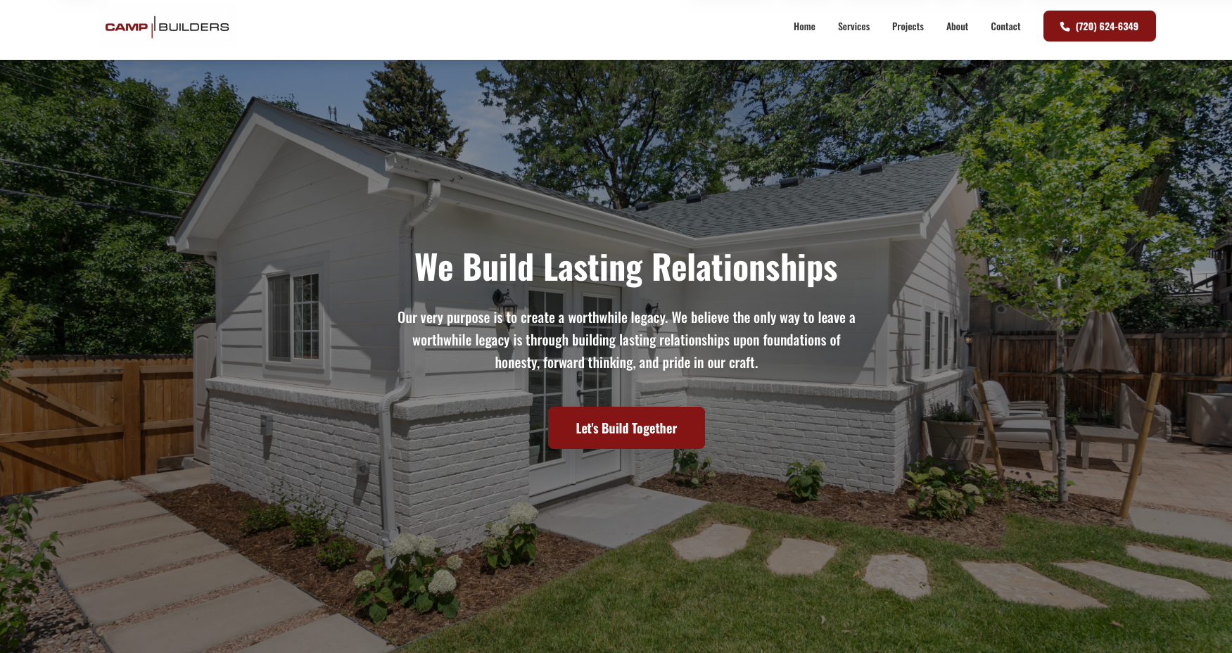
Old hero image and intro copy
Why this is an improvement:
The design is cleaner, with less clutter and greater focus on the company's vision and purpose.
The image stands out better as a symbol of what the company can accomplish.
The CTA button was removed from the navigation, making it clearer how to contact the company.
Other significant improvements:
We improved the site’s copy, using language that aligns with Camp Builder’s focus on end-to-end project management and relationship building.
We reduced any noise, such as extra CTA buttons.
We created a new contact/intake form.
We aligned the site with current SEO trends in the construction industry, taking extra care to research which terms local customers were using to find services like Camp Builders.
We are now creating a publishing plan for blog posts and other content to establish Camp Builders as a trusted voice in the field.